Documentation
Design principles
Visual
Use images, colors, and other elements that make the information clear on the screen.
Prefer images, icons, and other visual elements whenever possible to maintain clarity. Text appears in a second step, when a fact is selected for more detail.
Explicit
The goal is to display as much information as possible on the screen, without it becoming overwhelming.
To encourage curiosity, there must be elements that invite people to look and search. If panels are hidden and only displayed upon request, if only icons are shown with no details of what they represent, if content is only revealed through clicks and searches, no one is going to do it.
The challenge is balance: too much information ends up being almost the same as none at all.

Balanced
With so much information available, we must find a way to display the most relevant information at any given time, avoiding excessive information, as this can be confusing.
This principle competes with the previous one, and as mentioned, the challenge is balance.
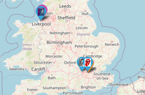
As an example of this principle, markers of facts considered less relevant are hidden when looking at the bigger picture (from a greater distance). And, as you zoom in on a location, new and more specific facts begin to appear.
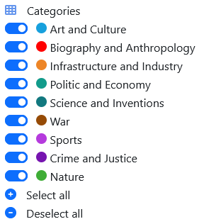
Organized
Information must be categorized and related, so it helps finding what's needed or relevant.
Categories, key elements, etc are all aiming to help on this.
Performance
Project has lots of information. It must remain ágil y con buen desempeño, ya que la lentitud puede espantar a los usuarios. Para esto, tanto la información como la funcionalidad pueden ser recortadas para asegurarlo.
Idealmente, esto se debe lograr con el mínimo impacto para los recursos del ambiente de servidores.
Se recomienda usar una PC y un monitor con buena resolución. Igual es posible verlo también en una tablet o un teléfono celular.